CSS & SCSS Development
Table of Contents
BEM Methodology
At Lemone, we use BEM (Block Element Modifier) as our SCSS syntax and guideline.
Naming Convention
Basic structure:
Multiple words (separated by hyphens):
SCSS File Structure
Each SCSS file should contain one Block maximum, with unlimited Elements and Modifiers:
.block {
  &__element {
    // CSS for element
  }

  &__element {
    // CSS for another element

    &--modifier {
      // CSS for modifier
    }
  }
}
Practical Example
@import "collection";
@import "card";

.product {
  &__title {
    line-height: 66px;

    &--bold {
      font-weight: 800;
    }
  }

  &__selector {
    padding-left: 5px;
    list-style-type: none;

    li {
      display: flex;
      align-items: center;
      padding-bottom: 10px;

      &:last-of-type {
        padding-bottom: 0;
      }
    }
  }
}
File Structure
Lemone uses a standardized file structure for styling:
styles/
├── main.scss                 # Main entry point
├── common/
│   ├── _common.scss         # Imports all common files
│   ├── _variables.scss      # Colors, fonts, sizes
│   ├── _functions.scss      # SCSS functions
│   ├── _mixins.scss         # Reusable SCSS mixins
│   ├── _buttons.scss        # Button styles
│   ├── _helpers.scss        # Helper/utility classes
│   └── _fonts.scss          # Font imports
├── layouts/
│   ├── _layouts.scss        # Imports all layout files
│   └── _grid.scss           # Grid system
└── components/
    ├── _components.scss     # Imports all components
    ├── _header.scss         # Header component
    ├── _footer.scss         # Footer component
    ├── _navigation.scss     # Navigation component
    └── product/             # Product variants folder
        ├── _product.scss
        ├── _product-card.scss
        └── _product-track.scss
main.scss
Main entry point that gets compiled to CSS:
// Common
@import "common/common";

// Layouts
@import "layouts/layouts";

// Components
@import "components/components";
Folder Purposes
common/ - Variables (colors, fonts, font-sizes) - Functions and mixins - Imported CSS framework code (Bootstrap, etc.) - Helper/utility classes - Button styles
layouts/ - Grid system (from CSS framework) - Layout-specific adjustments - Container styles
components/ - All project components - Header, Footer, Navigation - Custom blocks
Block Variants
When a block has multiple variants (e.g., product-card, product-track), create a folder for the original block containing all variants:
One file per Block - Create a new SCSS file for each BEM Block.
Stylistic Sets
Many fonts include stylistic sets - alternative glyphs for letters or numbers within the same font file. This allows multiple designs for the same character using OpenType features.
Using Stylistic Sets
In fonts.css:
@font-face {
  font-display: swap;
  font-family: Lufga;
  font-style: normal;
  font-weight: normal;
  font-feature-settings: "ss02" 1;
  src: url("~@fonts/LufgaRegular.woff2") format("woff2"),
    url("~@fonts/LufgaRegular.woff") format("woff");
}
The font-feature-settings: "ss02" 1; switches the character bound to ss02 to its second set.
Tailwind Configuration
Configure stylistic sets in tailwind.config.js:
module.exports = {
  theme: {
    fontFamily: {
      head: [
        '"Lufga"',
        'sans-serif',
        {
          fontFeatureSettings: '"ss02"',
        }
      ],
    }
  }
}
Exploring Font Features
Tools: - Font Gauntlet - Quick font exploration tool - Figma OpenType - Use OpenType in Figma
Tooltips
Creating complex tooltip shapes with CSS, including shadows.
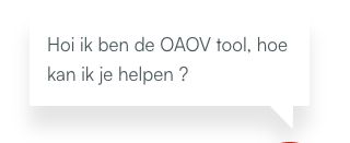
HTML Structure
<div class="tooltip-wrapper">
  <div class="tooltip" role="tooltip">
    <p class="relative z-30">
      Hi, I'm the tooltip, how can I help?
    </p>
  </div>
</div>
CSS Styling
.tooltip {
  @apply absolute bottom-8 w-64 p-4;
  left: -200px;

  // Tail dimensions and position
  $base: 1.25em;
  $height: 1.25em;
  $position: 90%;           // Tail position (left to right)
  $position-x: 4%;          // Tail shape adjustment
  $border-radius: 4px;
  $color: #fff;

  border-image-slice: 0 fill;
  border-image-outset: 0 0 $height 0;
  border-image-source: conic-gradient($color 0 0);
  border-image-width: $border-radius calc(100% - $position - $height / 2) 0 calc($position - $base / 2);
  border-radius: $border-radius;
  background: $color;
  clip-path: polygon(
    0 100%,
    0 0,
    100% 0,
    100% 100%,
    calc($position + $base / 2) 100%,
    calc($position + $position-x) calc(100% + $height),
    calc($position - $base / 2) 100%
  );
}
Variables explained:
- $position: Tail position along the bottom (left to right)
- $position-x: Adjusts tail shape (default V-shape)
- $base: Tail base width
- $height: Tail height
Drop Shadow
Note: Use filter: drop-shadow() instead of box-shadow to apply shadow to the clipped shape.
Resources
Useful Generators
These CSS generators make development easier:
Layout & Grid
- CSS Grid Generator - Visual grid builder
- Flexbox Generator - Flexbox layout tool
Effects & Shadows
- Box Shadow Generator - Box shadow tool
- CSS Gradient Generator - Gradient creator
SVG & Images
- SVG URL Encoder - Escape SVG for CSS
- Image to Base64 - Convert images to base64
Shapes
- CSS Triangle Generator - Triangle via border
- Clip Path Maker - Visual clip-path tool
Animation
- Cubic Bezier Generator - Easing functions
- Keyframes App - Animation tool
Colors
- Color Picker - Color selection
- Contrast Checker - Accessibility contrast
Best Practices
- One Block per file - Each BEM block gets its own SCSS file
- Use meaningful names - Clear, descriptive class names
- Avoid deep nesting - Keep nesting to 3-4 levels maximum
- Use variables - Store colors, sizes, breakpoints in variables
- Document mixins - Add comments to complex mixins
- Mobile-first - Write mobile styles first, then add desktop overrides
- Use helper classes sparingly - Prefer component styles over utilities
See Also
- Linting Setup - Stylelint configuration
- Working with Assets - SVG and images
- Code Editors - VS Code and NeoVim setup
- WordPress Development - WordPress theme development